Note
This project is a two part case study encompassing the temporary site and the final WordPress site. Both sites I was the sole designer and developer.
Overview
I've had the pleasure to design and develop a website for a brand new luxury Korean spa called SoJo Spa Club located in Edgewater, NJ. This project is a two part case study encompassing the initial temporary site and the final WordPress site. I was the sole designer and developer for both sites.
Before being commissioned, there was an existing site that was built on a custom CMS platform provided by Navy Zebra a payment processing company. The CMS platform allowed developement to be built on the Bootstrap Framework, luckily I learned web developement with Bootstrap so I'd thought it would be a breeze.
Fake it till you make it
First and foremost, let me come out clean and explain that I am not a developer by trade. However, I have built personal projects in the past. With a basic knowledge of development, I dove straight into the deep-end.
Challenges
A fully functioning site containing 25 pages was to be built in 2 weeks, before the grand opening of the facility. No pressure! The excitement of working on such a large project with a large audience was really motivating.
Environment
The first challenge was setting up the environment. I had to familiarize myself with working with Navy Zebra's CMS platform which could only be accessed on approved devices. I was given a Windows laptop with access. Assets were uploaded via FTP using FileZilla onto the Microsoft Azure server. And code was published through Navy Zebra's CMS software. This was foreign to me since I have never worked with a CMS platform.
Time
Secondly, designing an appropriate site that could be quickly developed within the strict deadline was the biggest challenge. Initially I thought it was great having both roles, but afterwards I really appreciated working with devs and how their insight could set design boundaries.
Assets
The third challenge was the image assets. They were mediocre to say the least. The perfectionist in me was hoping to be working with beautiful proportionate assets. Allocating enough time to retouch and crop image assets.
Audience
SoJo Spa Club being a staple in luxury spas I was challenged to design a site that reflected a destination of such magnitude. Pleasing patrons before, after, and during their visit was the goal. Designing for a unique audience who have little to no knowledge of a Korean Bathhouse was the biggest challenge. Luckily, I had the pleasure of working with the one Graphic Designer who was also a fellow RISD Alumni. She designed the signs and prints which set a great foundation for me to work with.
Again, time was NOT on my side. (Probably never have been...)
Process
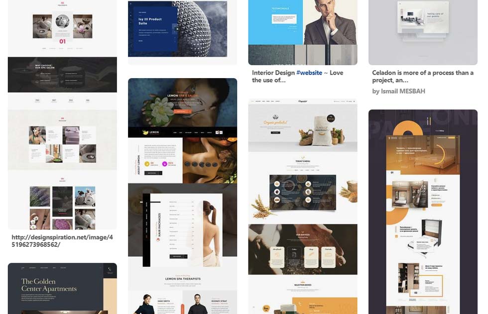
It all began with finding inspiration on my favorite resource, Pinterest. Over the past 4 years, I have curated the latest web design trends on Pinterest. From my previous findings I filtered down a couple of designs worth building. Afterwards asked the client for feedback on my findings to move forward with lo-fi mockups.
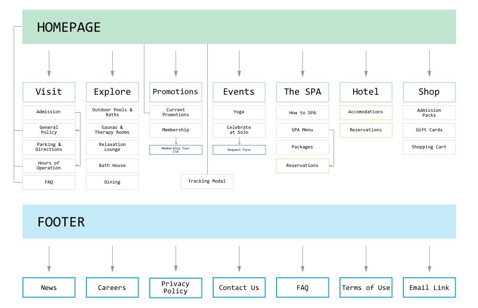
Since this was a informative website showcasing features of SoJo, the UX aspect was straightforward. Each page offered information about amenities and admission. Sometimes accompanied by CTAs to book spa treatment services or to display more information.
Two weeks equals 14 days, minus 1 day for final review. So 25 pages total divided by 13 days equaled, (1.93) or 2 pages to be completed a day. I gave myself a 20 hour per day work schedule. Which gave me approximately 10 hours to build a single page. Within those 10 hours I allocated some time to edit CSS and photos. Caffeine was my best friend and sleep was my enemy.
Luckily I had a CSS library built and complied over the years based on personal projects and miscellaneous themes found on the web. This made developing a lot easier since I already knew the classes required to build specific containers and elements. It was my secret weapon.
For copy, SoJo outsourced a marketing agency that provided me with a word document. CRTL+C CRTL+V MANY times.
Did he do it?
After 222 hours, 4 gallons of coffee, and 134 emails later, the site was operational. Without the CSS library, I wouldn't have accepted the project.
hover over screen
Takeaway
It has been a fantastic learning experience and journey designing and developing SoJo's site. With over 500 daily visitors it was very rewarding to say the least. And during the course of 2017 it was humbling to hear the positive comments towards the initial site. Little did they know the site was temporary.
As a result of this experience, I learned how to design and develop a commercial website. From optimizing images to code, the project allowed me to flex my multidisciplinary design background. Initially I thought to myself how easy I had it since I was the designer and developer, but boy I was wrong. Having a stronger background in design, I defaulted in exploring more complex designs which ended up being hurdles during development. Finding the balance of what was possible without the input of a developer was challenging. The solution was to tame the perfectionist in me to progress in code. Building out the structure then dressing it up with style elements was key to completing the project in time. Granted, some of the pages was not my best work, but since the site was temporary, improvements were made down the road.
WordPress
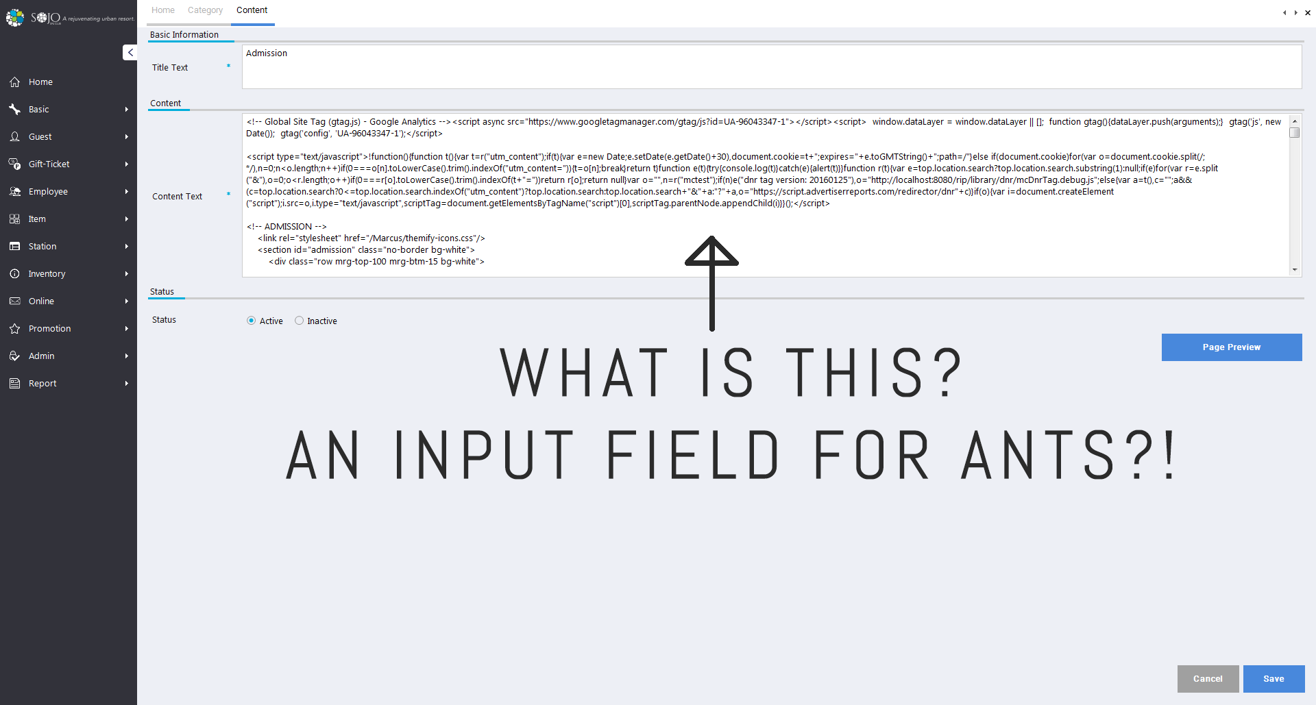
After a year since its completion, my colleagues and I realized the shortcomings of the CMS platform. Pain points started to become more clear. Copy edits for non-developers was a huge one. The CMS platform had a very small input field for the code. This meant selecting the code > select all > cut > paste into a text editor > edit > paste into CMS > save > open up the page with a CMS unique URL to publish content. We were lucky the copywriter was familiar with code to make those changes off CMS.
We all thought it would be more optimal to have a central interface to make whatever change necessary. WordPress was the solution. Easy to scale, Azure compatible, and a expansive plugin library and customization options. Once again I had zero knowledge in WordPress and a new venture began. Learning never stops!
Challenges & Goals
The learning curve was monumental. I knew the majority of the www was built upon WordPress. Developing and maintaining through a cloud based server was another monster. Below I have listed the major challenges I will explain in the process section.
Local environment
Themes
Customizing Theme
Plugins & Compatability
Creating Web App on Azure
Caching
SEO
CDN Endpoints
SSL Certificates
DNS Settings
Debugging
Process
Local Environment
To learn the ropes I created a local WordPress webapp by using MAMP to create a local server. This allowed me to understand WordPress' dashboard and backend of the application for free. I quickly realized building a full custom theme would require PHP knowledge. It was a no brainer to utilize a theme that closely matched the previous site.
Theme Shopping
There are an immense amount of premium themes on the web. One thing to note is to look at the shortcodes for each theme. The shortcode shows all the elements the theme offers. What I was looking for was pricing information cards that could be easily modified to my needs.
Building
After learning how build using WPBakery Page Builder it became clear as to why so many sites are built on WordPress. Without prior knowledge of development it is extremely easy to hammer out page after page. More complex designs can be accomplished with raw HTML. Building begins with creating a row or section and nesting child elements. Basic structure would look like this Section > Row > # of columns > elements (ie. text blocks, images, input fields, etc). Everything is a click away and page structures are easily modified adjusting the column height or width. There are responsive options to adjust column widths. Initially it was a pain in the ass not being able to see changes live. I would have to preview the changes, then use Chrome's dev tools to inspect and adjust and note the CSS and then go back to the dashboard to apply the changes.
WPBakery makes it easy
In under a minute I created 4 elements. Everything is a click away.
Modules
However, building elements with modules made everything easier after the first run. WPBakery Page Builder has the option to save your element or module with changes to call them in later on when needed. Where things got more difficult was when the presets did not offer what I was looking for and adding custom raw HTML was the only solution. As expected, WordPress has set classes that can be called on to create a element. These classes were only identified by inspecting elements via dev tools that were the closest to what I was looking for. For example on the Homepage under 'Daily Admission' I had to create the two pricing cards. The card is using class "stm_pricing-table stm_pricing-table_style_1" naming those two classes defines a container with universal padding. Nested under that div were "stm_pricing-table__head, __pricing, __contant" that housed exactly what they imply. Each page can have custom css if additional styling is necessary. The key takeaway here is to find the classes that closely resembles your design and adjust CSS.
Plugins
A key feature of WordPress is the plugin library. Users are able extend functionality or add new features to their sites. Below I have listed key plugins I added and reasons why. This will get long so skip over if no interest. I thought it was interesting to show the amount of basic plugins required to have a optimized and fully functioning commercial site.
All-in-One WP Migration: A key feature of WordPress is the plugin library. Users are able extend functionality or add new features to their sites. Below I have listed key plugins I added and reasons why. This will get long so skip over if no interest. I thought it was interesting to show the amount of basic plugins required to have a optimized and fully functioning commercial site.
WPMU DEV Dashboard: This was an interesting discovery. It's basically hub that offers many premium plugins that doubles as a system monitor. There is also a community with supportive information. The reason I opted for this for its image compression plugin.
WP Smush Pro: Part of the WPMU's offerings. Reduces image file sizes to boost performance. Went through a slew of imcompatible image compression plugins and this one did the trick for me.
API Key for Google Maps: As the name states this allows you to add API keys to display Google Maps on the site.
Autoptimize: This optimized the website by compressing the CSS + JS.
Comet Cache Pro: By far my favorite plugin. Want to hit that A+ on Google Page speed? This plugin will be your best friend and guide. Caching is critical in WordPress site performance. It is used to minimize the amount of data that must flow between machines across the internet. This results in fewer requests between machines, which translates into a speed boost.
Contact Form 7: This allows you to create a simple but flexible contact form for your visitors. I used it mostly for 'Contact Us' forms.
Google Analytics +: Pretty obvious, collects statistics about visitors.
Insert Headers and Footers: Allows you to insert code above or under the fold. Users can manually insert header or footer code manually via FTP and PHP files. But this plugin allows users in the dashboard to easily make edits by providing a simple input field. This allowed the SEO to easily add in their code for analytics.
Instagram Feed: Display a customizable and responsive Instagram feed as a gallery.
Popup Maker: Easily create popups with any content. Comes with an editor to style the popups. I used this to house an iframe for the 'Track Shuttle' features where users can see where the Shuttle service is in real time.
Really Simple SSL: This plugin detects if an SSL certificate is active on the site and configures the site to run over HTTPS. Very important for keeping connection secure and safeguarding sensitive data between two systems.
Azure Portal
Once the site was complete locally, it was time to migrate over to Azure. Step 1 was to backup using All-in-One WP Migration. WIth a click of a button it creates a single backup file, including database information. On the Azure side the entire dashboard was intimidating. It being a Microsoft product, I assumed the entire process would be very challenging. Intimidating at first, however everything is laid out simply so the learning curve was shallow.
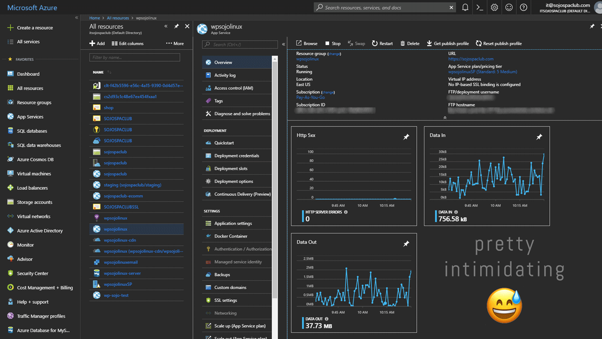
There were plenty of resources and information out there with step by step instructions on Azure blogs and forums, Stack Overflow, and Youtube. Step 2 was to create a web app. It was a step by step process to configure the WordPress application, database, server, region, and blob container (storage). I opted for a Linux server after reading that others experienced better performance compared to a Windows Server (figures...). Azure offers 6 tiers for 'App Service Plans' which defines a set of compute resources for the web app to run. I selected Standard (S2). Final step was to launch the web app using the preset url determined by the web app name. wpsojolinux.azurewebsites.net.
Navigating to the url displays the WordPress initial setup. Once in the dashboard, I've installed the 'All-in-One WP Migration' plugin and imported the file I have saved from my local web app. Voilà! A mirrored copy of my local web app in the cloud! Content, plugins, the whole 9 yards.
Caching, CDN, and Compiling
Prior to this project I had no idea what caching and CDN were. Found out the hard way agonizing over the 15 second page loads. This is where Comet Cache plugin came in. It was a simple plug and play. Minor tweaks to add a CDN endpoint (content delivery network) which refers to a geographically distributed group of servers which work together to quickly deliver content to the the end user. Finding the right one was a trial and error. Microsoft Azure provides three different options and the Akamai (S2) worked best for my application. More info about Akamai here. Compressing and compiling HTML, CSS, and JS was a must since WordPress is VERY heavy. This was done using the Autoptimize plugin which was a plug and play solution.
Results
450+ hours later within a span of 3 months the WordPress site was live. 26 pages of glory without prior knowledge of WordPress and Azure. It was a tedious journey but what I've learned during this experience was amazing.
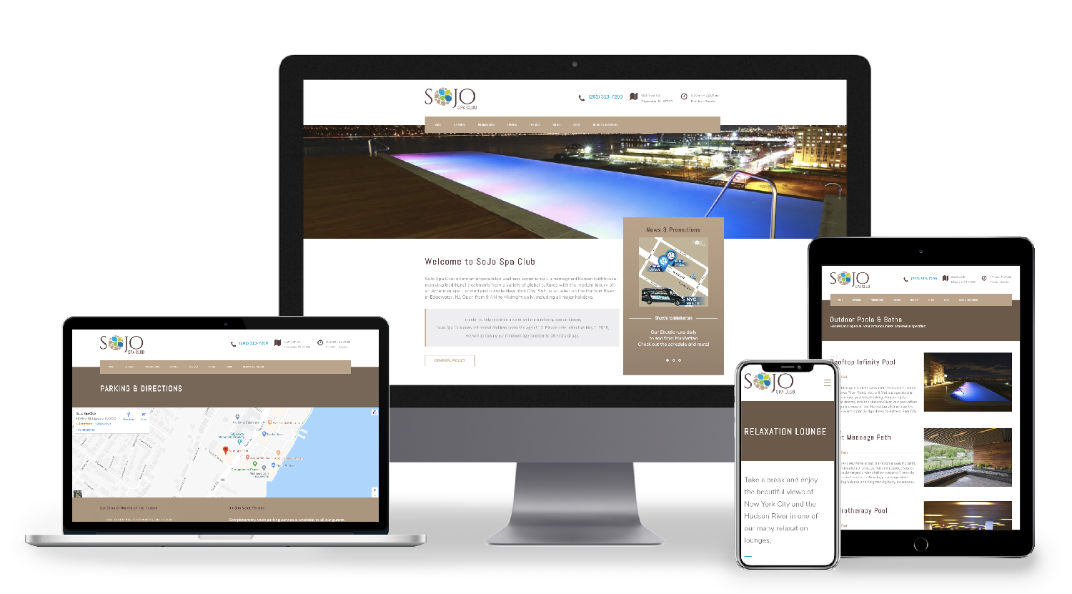
Hover over screen
Final Takeaway
The first website challenged my actual development knowledge. Where as the WordPress site showed me the importance of site optimization and backend health. Learning about building web apps on the cloud was super motivating me as a UI/UX designer. As designers we often overlook what is necessary in order for our designs to take shape. Treading through the front and backend made me realize those operations that were happening behind the screen. Deadlines and development limitations truly dictate the final design. That being said WordPress is really easy to use for non-developers. They can easily modify the site using the modules and templates that I have built. The final product of a website is never really final. Constant updates have been made to either optimize the site or change copy and images. With the recent addition of analytics and tags, I will further improve the site to cater to the end user.
Thanks for reading! If you want to collaborate, geek out about web design + development, grab coffee, or just say hello, shoot me an email or connect via LinkedIn!