Overview
I was part of an early-stage startup formally called Patron, now Musae. Our vision was to build a platform for creatives and patrons to discover, network, and book other creative professionals for services such as photography, musical training, etc. In short, we offer free business tools to help creatives save time, make money, and acquire fresh new clients.
As one of the founding members I was required to wear as many hats as possible. I coordinated and led all facets of design including: defining user journeys, branding, product & visual design, prototyping, user research, and even the pitch deck for investors.
The Patron organization was truly amazing despite collaborating remotely across the globe. We were artists, engineers, musicians, designers, writers, hackers, and makers who came together with one mission. We applied Agile methodology and tasks were tracked and assigned using Asana task management tool.
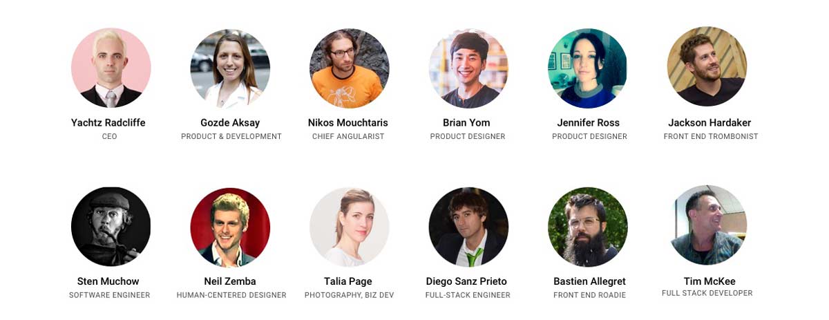
The Team
Challenges
As this was my first UI/UX role, there were many things that needed to be self-taught. In retrospect, my industrial design background helped me since the entire process, from research, ideation, concepts, prototyping, and testing, is quite similar. As one of the founding members, I was not restricted to follow any guidelines or a direct path. I considered this a plus since I enjoy experimentation and moving forward with failure.
Working with a team located all around the globe and with various full-time jobs presented a challenge. We had to work around time differences and coordinate our schedules, which was more difficult than anticipated.
For the product itself, designing for two user types on opposite ends of the customer journey was by far the biggest challenge. On one hand, "Creatives” want to showcase their talents and creative services, and on the other, “Patrons” want to discover and book creative professionals for their needs. But with no user-base to start with, we relied on competitive analysis for initial insights and best practices for design decisions. Ultimately, we conducted several rounds of usability testing to better understand our two user types and find a balance to meet their unique needs and expectations.
Goals
1. Formulate a design language system and choose the right tools.
2. Design an experience for creatives to curate a portfolio, show off their creative services, and partner with patrons.
3. Design an experience for patrons to discover and book creative services.
4. Growth hacking with 0 budget using social media and scraping tools.
5. User testing our platform for insight.
6. Rinse & repeat.
7. Create a pitch deck to obtain dough to pay for caffeine + beer.
Game Plan + Tools
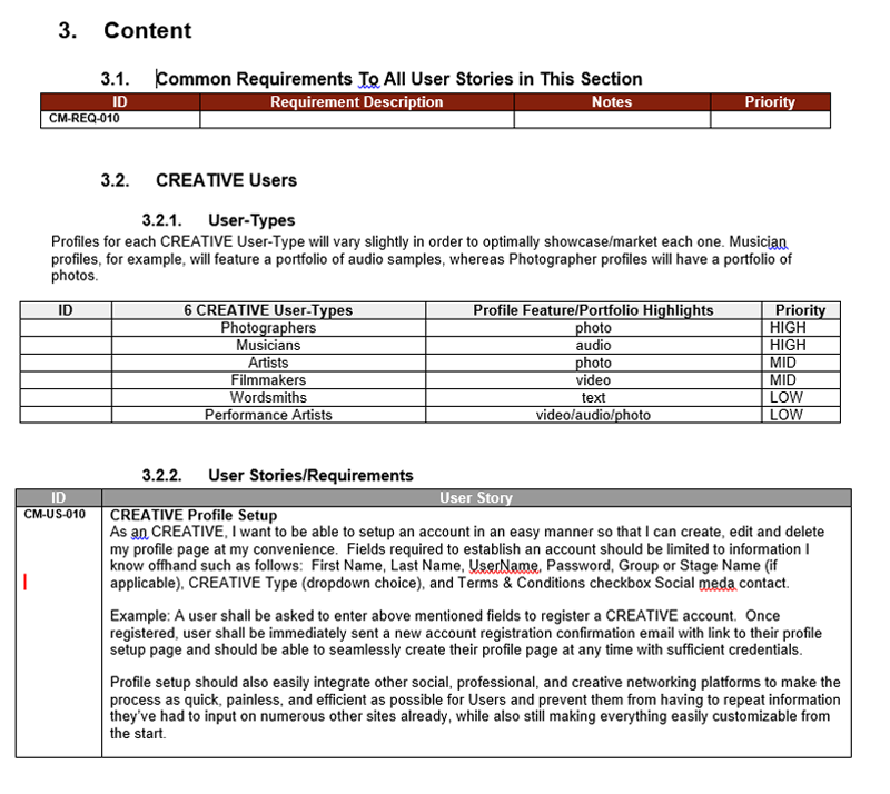
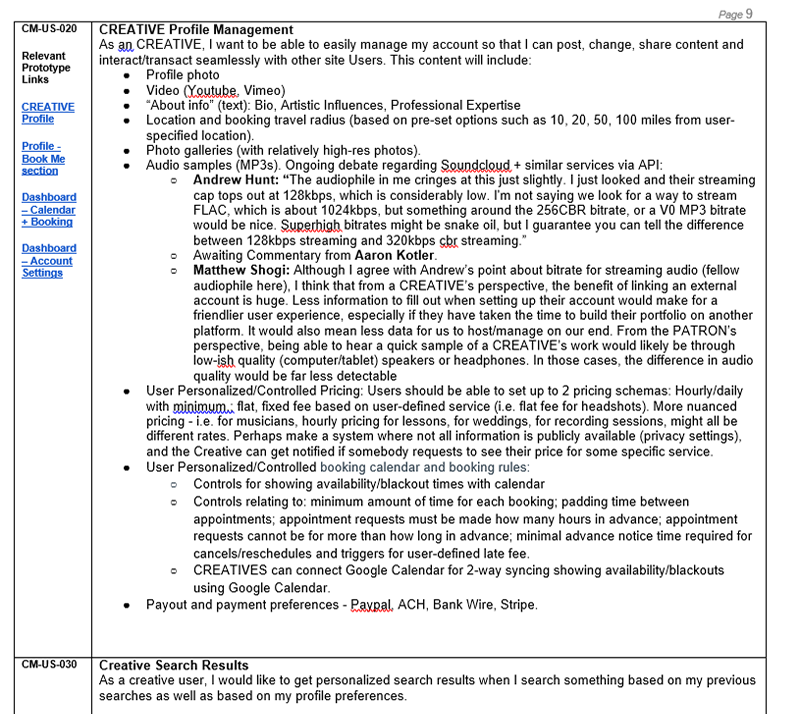
When I first joined the Patron design team, I was tasked with forming a game plan upon reviewing the company’s strategic business document which included everything from business goals, user personas, and feature requirements (see example pages below)
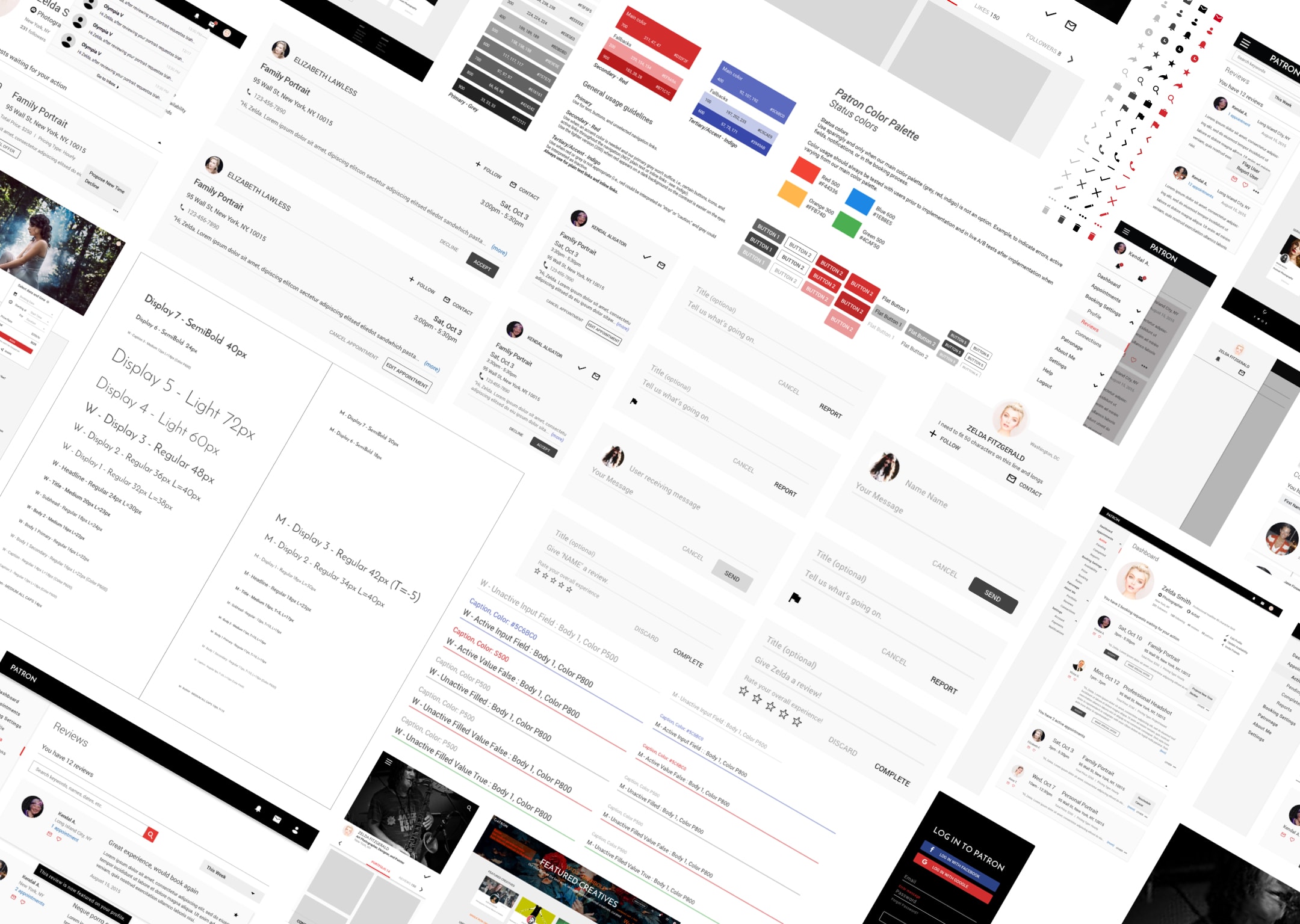
While reviewing existing prototypes that were designed in UXpin, I found that the experience was fragmented, unpolished, and difficult to proceed with development without first establishing a design language unique to Patron. So first thing on the agenda was to define our design system by adopting Angular Material to achieve a simple but proven components and style library. I conducted an audit to normalize and define all reusable components, responsive layouts, and breakpoints to establish a baseline pattern library. We later tested and iterated on specific components and layouts of the system for optimal usability.
As mentioned, the existing designs were on UXpin and Adobe Illustrator... So I suggested we move over to Sketch. Nightmares were averted and countless hours were saved after I set up our Symbols and Style library in Sketch. Adding uniform elements with a simple copy/paste sure as hell beat rebuilding in Illustrator. With the right tools in place, we moved forward to work on the product.
Identity
Our previous logo was clearly an afterthought shadowed by the development of the site, so I pushed the importance of a truly unique logo to establish the brand. I began doodling away, trying different ideas and many iterations of the same style. After reviewing with the design team, we narrowed the options down to the ones circled in red.
After further refining, I round up what we liked and leaned towards the designs that were isometric and utilized negative space to form the letter 'P'.
After refining the design further, we finalized our logo, and created this animation for fun.
Creative content is a personal experience for everyone, from the artists creating it all the way to the Patrons admiring it. We wanted to capture the essence of the arts by designing a blank canvas aesthetic that is dynamic to the unique creative content. This way, we are able to incorporate other forms, colors, and patterns to work in tandem with the creative content.
Design Process
Our development process was agile, working in 2-3 sprints.

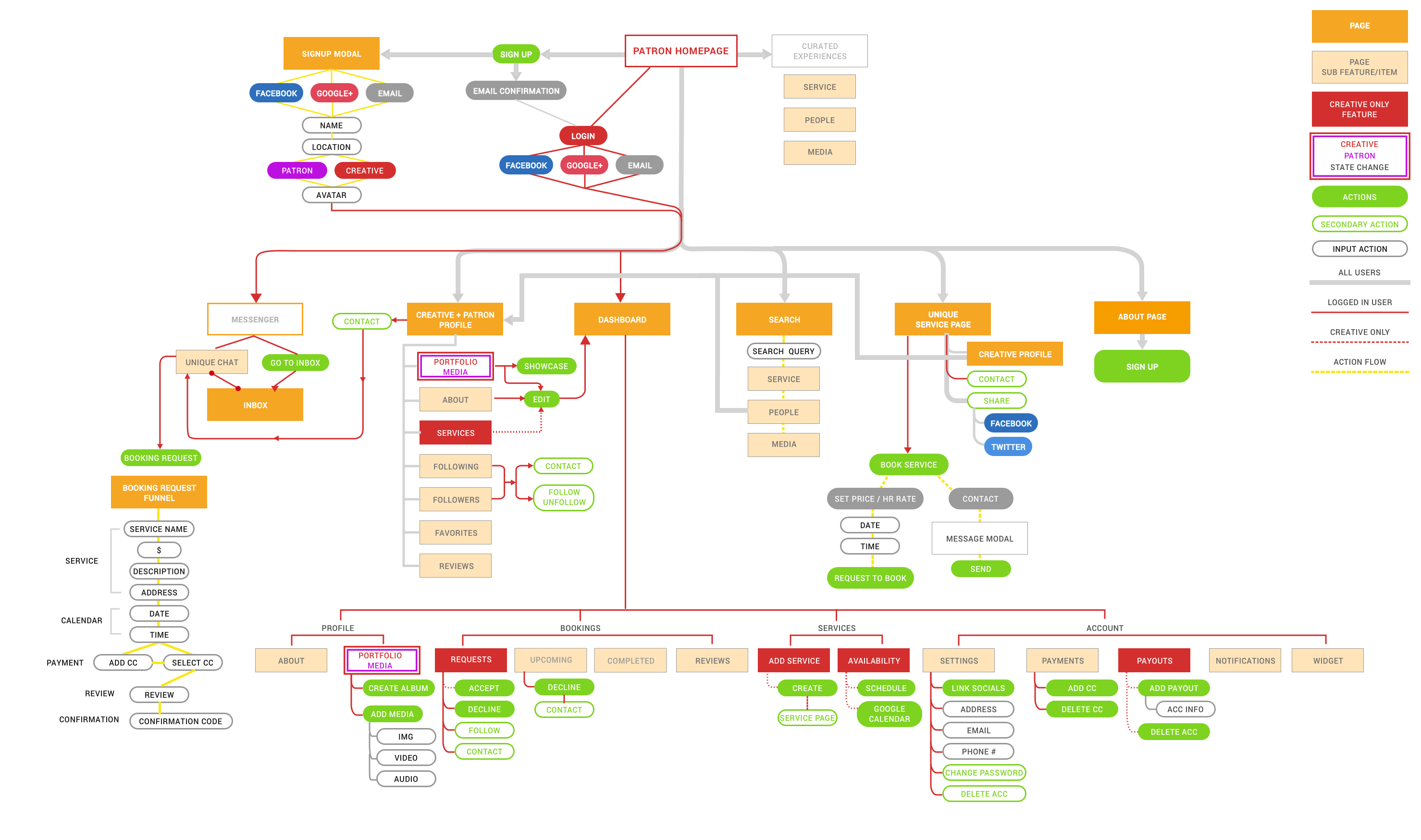
Although the product features and experience was laid and planned out in the strategic business document as mentioned above, we needed a sitemap to be able to visually communicate and connect the dots between our entire web app and map out our user experience. I created this sitemap and updated it periodically as features were added and modified.
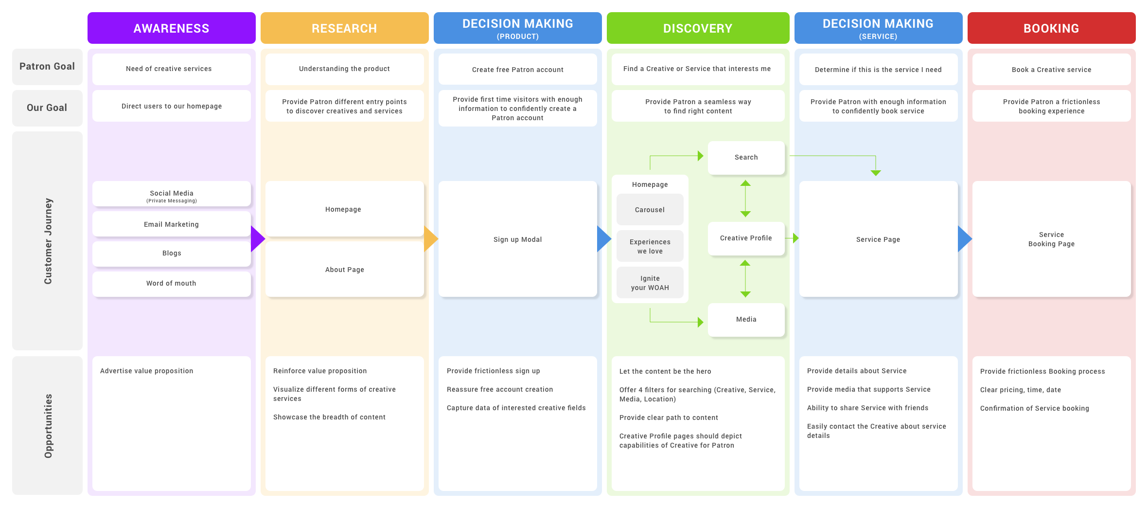
After plotting the sitemap, I created a diagram to map the customer/user journey to determine areas of opportunity across different themes. Figuring out the opportunities reinforced the feature requirements in our sitewide copy document.
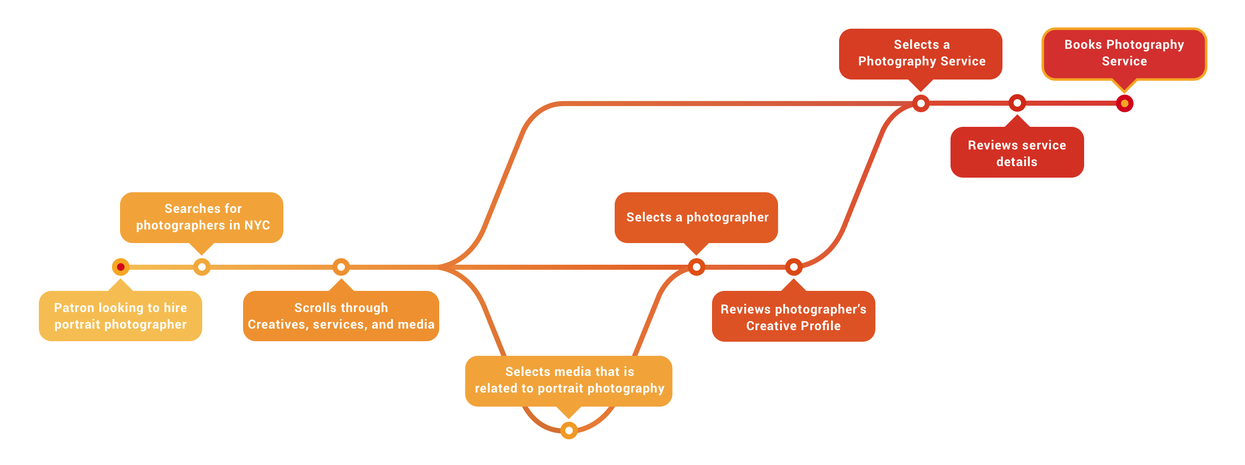
The diagram above showed the journey on a macro level. So I created a diagram depicting a Patron's journey to find a portrait photographer on a micro level. This helped us to determine the hierarchy of information and assets required for the Patron to experience a smooth process from searching to booking.
Competitive Research & Analysis
We did not have a direct competitor, but there were other platforms that offer similar features for discovery, booking, and profile/account management, such as Airbnb, Taskrabbit, Patreon, Fiverr, and Upwork.
After identifying our competitors and market, I conducted a competitive analysis of 13 products based on similar end goals that we were designing for. As such, I found it important to break out the analysis by major features that overlap.

The analysis was done by tallying y/n.
After examining what the market was doing with the homepage, I created several actionable insights below.
1. Hero image or video.
2. Short and catching intro describing our product.
3. How it works button on the navigation bar.
4. How it works section with illustrations.
5. No pricing info on homepage.
6. Listing out all categories on homepage.
7. Search bar on navigation or hero image/video.
8. Secondary User button on navigation bar with unique page.
9. Illustrations supporting overall aesthetic of product (if time allows).
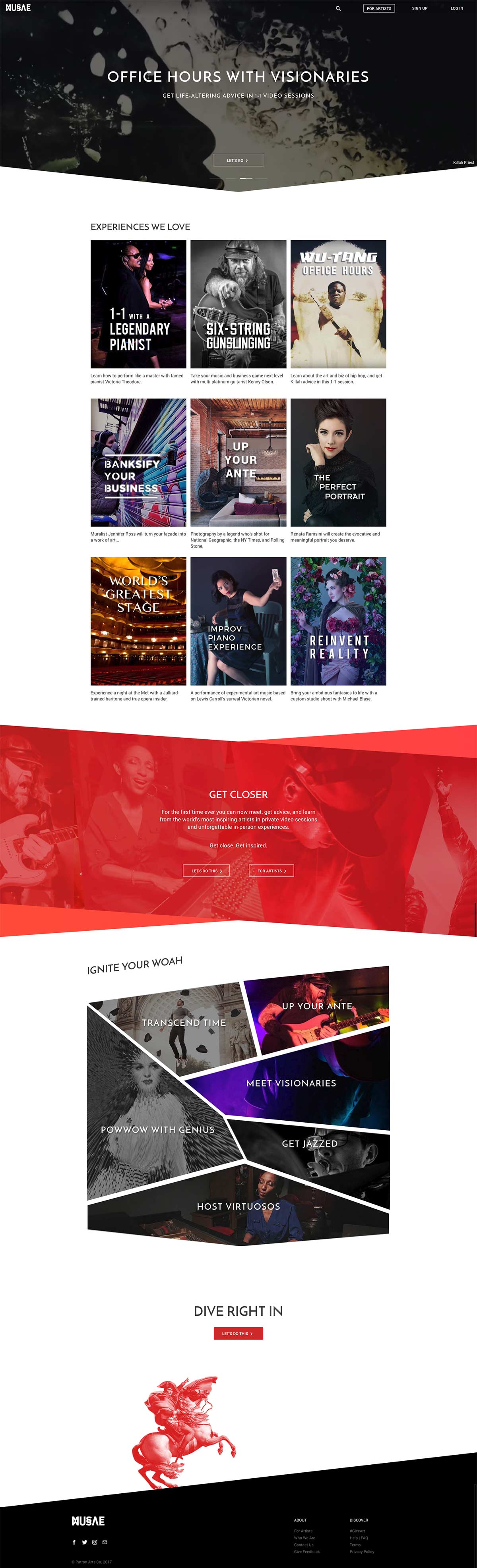
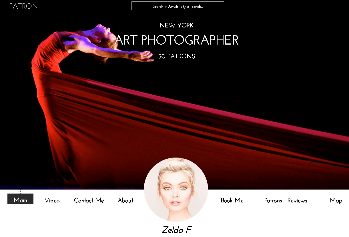
Homepage Design
We collected insights on how each platform introduced each feature to their audience and how they found a balance for the the two user types on the homepage. We learned that in most cases, the main site caters towards the Patron (in our case) to able to discover and consume the content or product. Content creators find and understand how the platform works on a separate path in the experience. By adopting this approach, we aimed to make it easy for Patrons to be delighted by services provided by Creatives, and for the Creatives to be inspired by other Creatives. Below is the end result of our homepage.
Signup Modal
I designed the signup modal with mobile first in mind to provide a frictioneless process. A simple step by step process with a visual confirmation page.
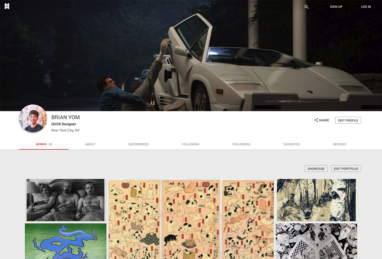
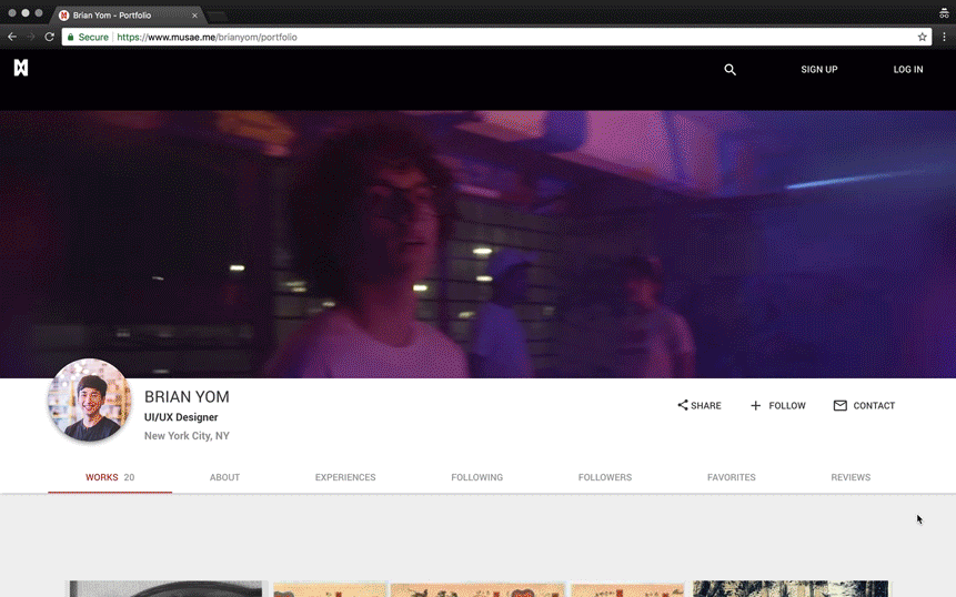
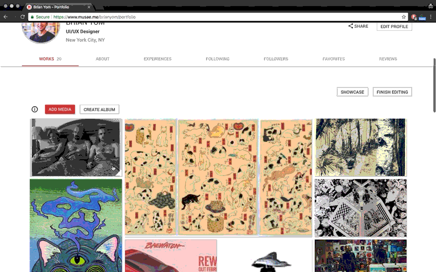
Creative Profile Page
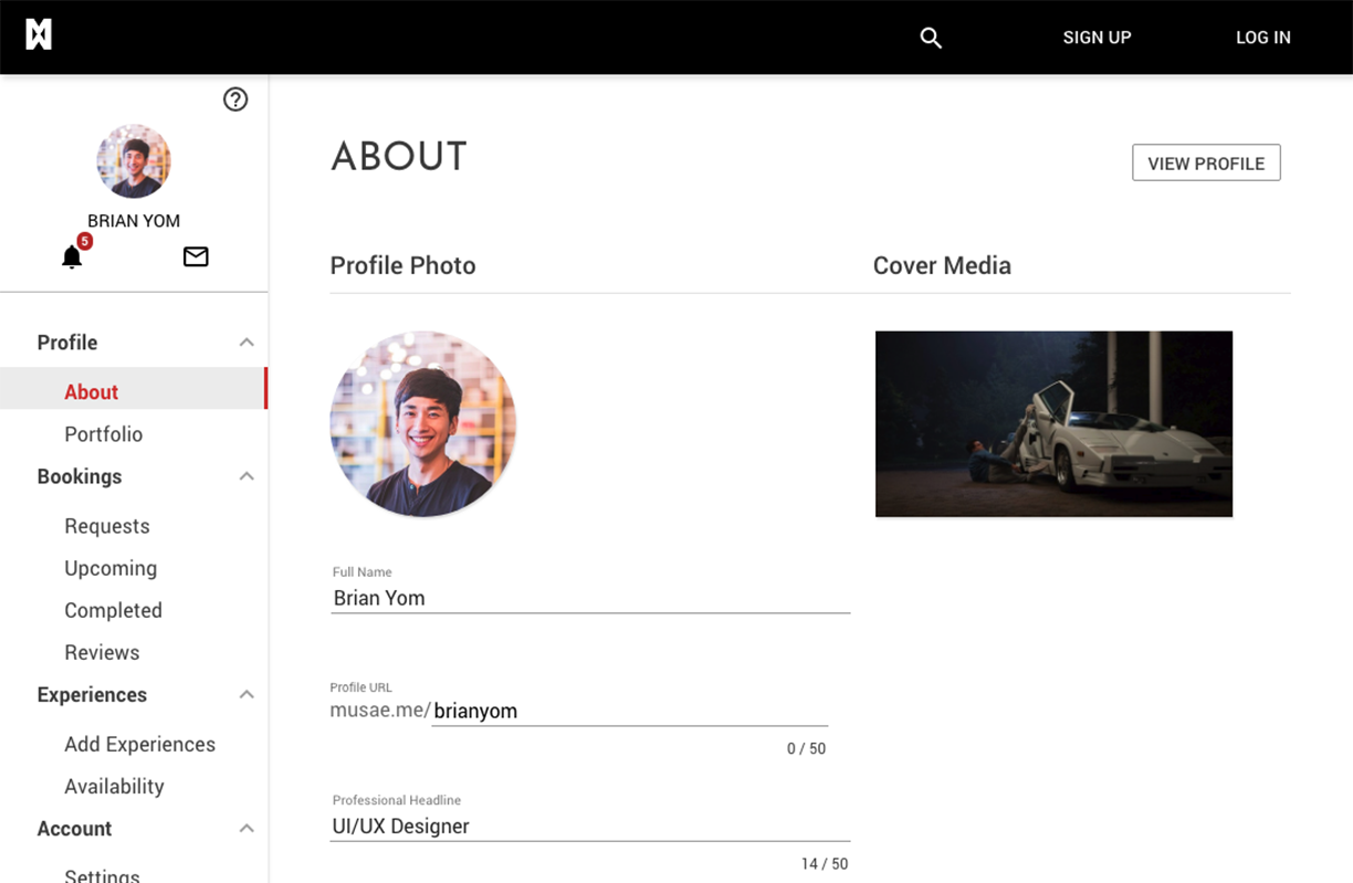
After studying the existing design of the profile page, it was clear that I needed to inject our design language for optimum legibility. The centered profile image provides balance, however in mobile it will cause spacing issues. Ultimately, I shifted it over to the left to provide ample room for user name and location.
For mobile I center aligned the elements after testing that high character names and city names will interfere with the positioning of the 'Share' and 'Edit Profile' buttons. While still retaining the tab menu that is horizontally scrollable.
Before
After
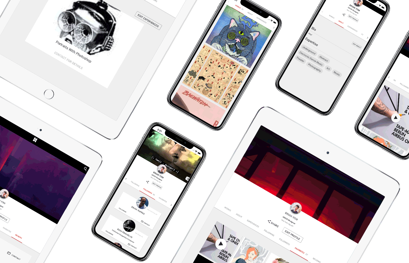
The menu items I nested into horizontally scrollable tab menu. It was easy to implement this to our prototype since the module already existed in Angular. Simple plug and play = save time.
We had two key requirements we wanted to incorporate to differentiate ourselves compared to other platforms. One was to allow users to upload videos as their cover media. A simple youtube link inserted into the profile settings, will allow users to make their page truly unique.
Secondly, a customizable portfolio. Where users can drag, resize, and customize to their delight. No other portfolio platform offers this amount of customizability. We were super excited to deliver and offer this feature for both Creatives and Patrons. This was a web only feature.
Dashboard
The dashboard is where creatives easily manage their profile, portfolio, and bookings. I designed a left column that houses all the dashboard menu items. We have created cards for Booking items, adding experiences, and reviews.
before

after
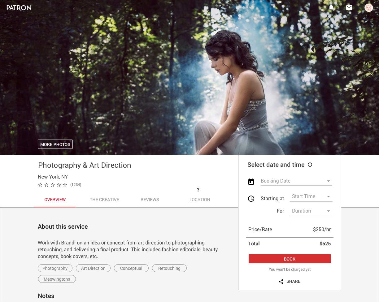
Creative Services
The unique Creative Services needed to have its own unique page. Once again we relied on the good folks of Airbnb to provide a similar design.
During this design phase I quickly realized the importance of having modules for the developers to simply modify in order to serve our needs. So I designed this page to utilize our existing tab menu bar (from the Creative Profile page) that provided the service name, location, and page shortcuts. The right side housed the container for the booking feature.
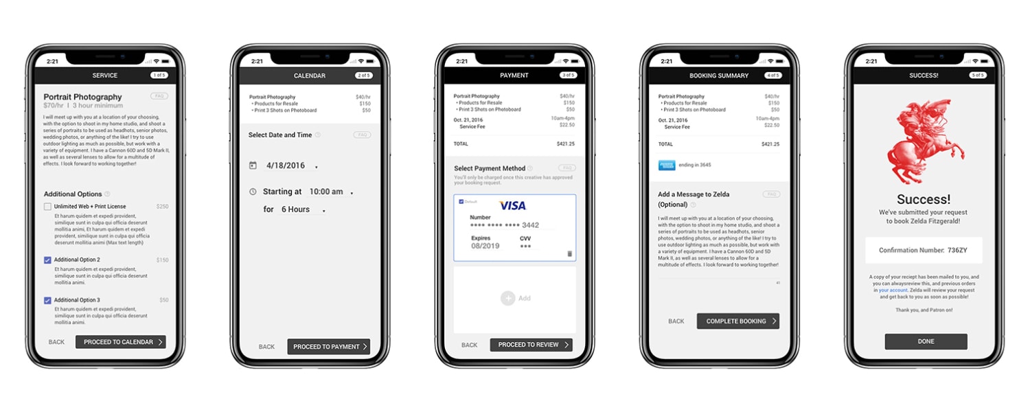
Booking Process
Being a booking service for Patrons, it was insightful to lay out the 3 macro scenarios that ultimately drives the Patron to book the creative service. This was visualized in the Patron's user flow below.
User Tests
Couple major features we wanted to test were the homepage, signup process, creative profile, and booking process. After looking back at our user stories we populated questions on Google Forms. We reached out to a couple users via our messaging platform based on their activity on our platform. Then tested via Google Hangouts using screen share. The test included open ended questions and 1-10 scale questions.
After testing with 25 individuals, there were 7 most requested features and to our surprise no issues with the interface and experience. We assumed our careful planning worked out.
1. Create custom username.
2. Customize portfolio on page..
3. Ability to add media on service page so patrons can understand service better. Rather than navigating to the Creative’s page.
4. Show related services on a specific service page.
5. Ability to create albums to organize portfolio.
6. Search services by location.
7. Ability to create custom tags to increase our library and improve search.
We implemented all the requests and they are on the live site today.
User Acquisition
After several months of hard work it was time to reach out to friends and family. Then the next outer circle was ALL of our Linkedin connections. We acquired around 1000 users.
During the second round, I created an email list using a scrape tool called ScrapeBox. This tool allowed me to search specific keywords on Google Search, Facebook, and Twitter to return URLs that contained the keyword. Then used the tool again to harvest email address from those pages. This powerful tool allowed us to harvest up to 20,000 email address in 24 hours. I cannot believe this is even legal lol. After creating an email list with Excel, the Streak Plugin for Gmail was used to email blast. Our conversion rate was around 2% which was far below our expectations so we decided to scrap the tool and pivoted to another strategy.
Our third round, primary relied on contacting creatives in other social media platforms. I was in charge of contacting creatives on Instagram, Twitch, and Ello. All exchanges of messages were tracked using a pipeline tool called Streak. This intimite approach was more successful but was a timely process.
Pitch Deck
During the design process, it helped our team to reflect back on our primary goals and target audience. To reinforce the WHYs of brining Patron to life. I worked hand in hand with the CEO.
Startup Experience
Reflecting back to my time at Patron, I have experienced the rapid advancement of my design abilities. It was very rewarding to be able to tap into various design skills from graphic, web, and video editing. You have to be a team player, working with devs to break down your designs, explaining the importance of the 60 character count for optimal legibility to the CEO. It was all hands on deck almost all the time. One thing I am most proud of was learning how to facilitate the team to define a design language and product so it no longer was just UX Pin screenshots.
One of many notable skills I picked up was self-learning. Figuring things out as you go along, by reading design blogs on Medium, and diving into Stack Overflow. It really is a skill to be able to ask Google the right questions.
Trusting your instincts based on qualitative research was another one. Risk taking is great, but sometimes overstepping out of your comfort zone might do more harm than good. Taking that risky idea and exploring why it might be the right solution was key to build successful features.
I learnt the granular complexities that go into designing a product/feature from scratch and how integral the role of a UI/UX designer is within the team.
Thanks for reading! If you want to collaborate, geek out about web design + development, grab coffee, or just say hello, shoot me an email or connect via LinkedIn!