PERSONAL
PORTFOLIO
PORTFOLIO
01
01
The biggest challenge for most creatives and designers in their careers is to create a personal portfolio that reflects and embodies their thoughts and ideas. Regardless of how many hours spent, you always seem to circle back and think of other possibilities.
Navigating through the infinite design trends, inspecting other people's elements, smushing the bugs, ALL to sell yourself or to satisfy your personal design goals. Frustrating to most but personally this pursit of perfection is what I enjoy the most. Sometimes too much...


After watching the original Blade Runner, Blade Runner 2049, and Ghost In A Shell, the compelling future facing UI experiences immediately grabbed my attention. The idea of simple glowing lines placed together to create a futuristic experience is what attracted me the most.
But given the task to create a portfolio where the work is the main focus, I had to dilute the aethetic.
I have gone through several versions of the site to fully portay my focus on expressing the maturity of my work, aesthetic phase, and creative mindset that guides my professional and personal life.
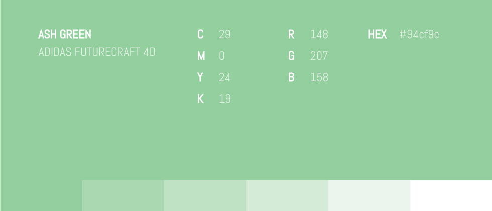
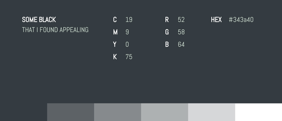
As I was shopping for new running shoes on Adidas, I coincidentally came across the collaboration between Adidas and a 3D-printing company called Carbon. Together they created the next breakthrough in athletic footwear called Futurecraft. Digging deeper into the shoe I landed on the Adidas Futurecraft site which adorned elements in Ash Green. I couldn't afford the shoe, but the color (#94cf9e) is free :). Placed on a shade of black with blue tones, Ash Green appears ghostly and well complemented by the blue under tones.
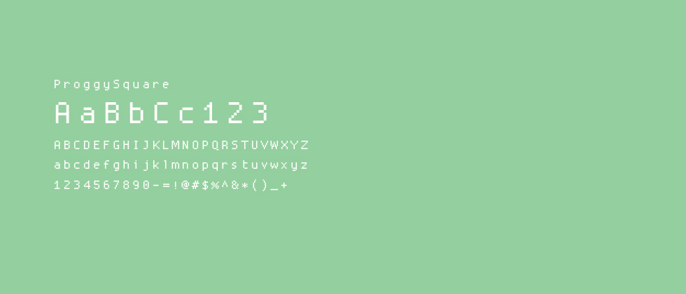
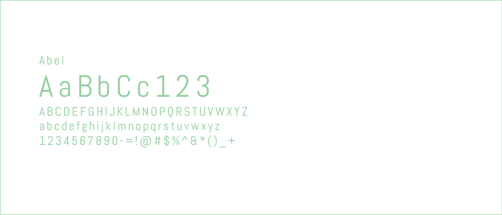
While building this site, the majority of my time was spent on a text editor that uses a programming font called Source Code Pro. Facinated by the font family I decided to explore more options and found ProggySquare. Created on a bitmap, I thought it was the perfect choice to further push the futuristic aesthetic. Pairing it with Abel which is one of my favorite web fonts.
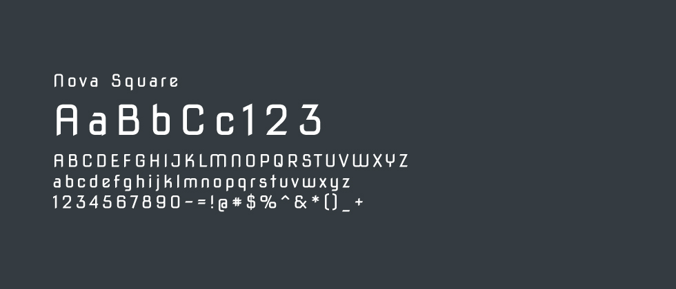
During my search for programming fonts, I came across Nova Mono, designed by Wojciech Kalinowski. It was a free monospaced programming font that was inspired by stone inscription alphabets. Within the Nova Font family, Nova Square tickled my fancy since the all the letters fit within a rectangle and the end strokes of each font reminded me of those on analog fonts.
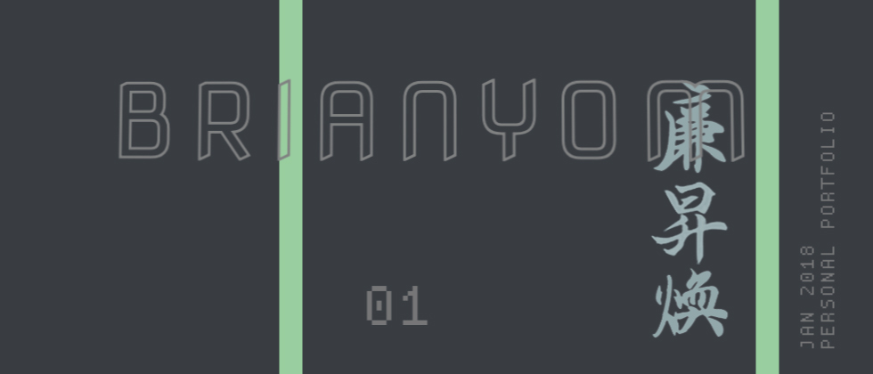
The idea behind the rectangle shape was to symbolize my logical (thanks to my asian roots) and creative mindset. Placing elements in and outside the rectangle portrays my constant urge of thinking outside the box (rectangle). To break out of the habit of wanting to control and obtain an idea or design within restrictions. Pushing my boundaries as a creative where a constant battle between logic and creativity exists.
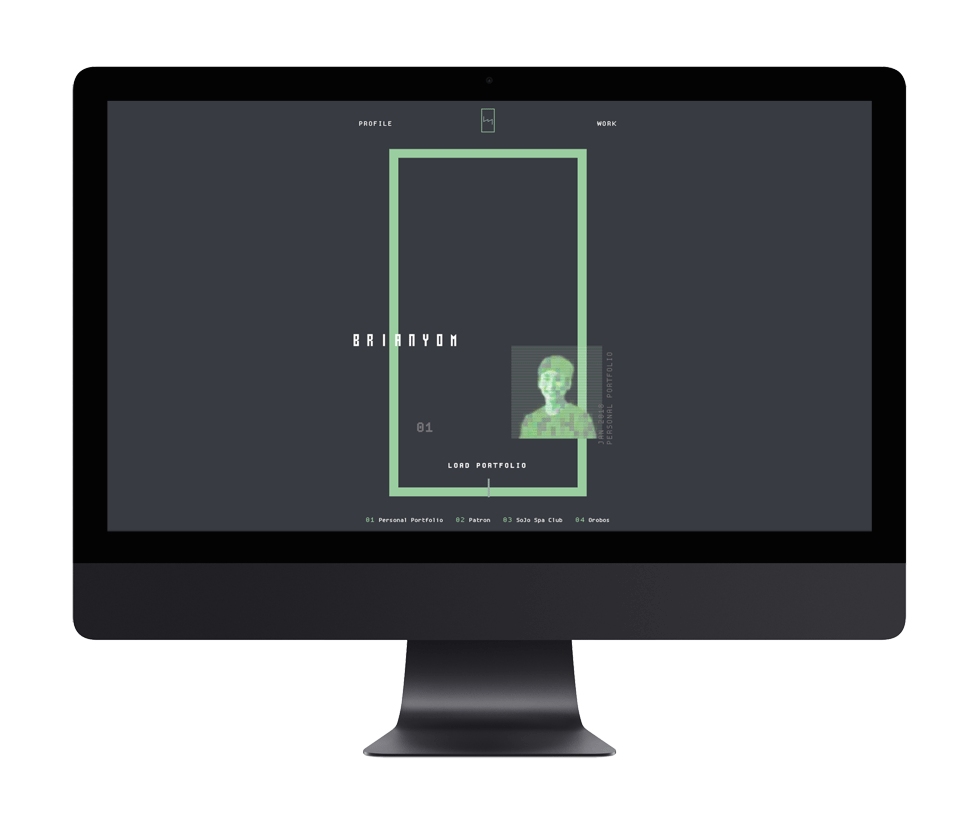
For this challenge, I focused on delivering purposeful elements sprinkled with a minimal amount of personal aesthetic. Rather than inserting the jungle of design interests revolving around my head.
Thanks for reading! If you want to collaborate, geek out about web design + development, grab coffee, or just say hello, shoot me an email or connect via LinkedIn!